 4. UI Customization Reference
UI Customization API
Themes
The SDK supports easy and thorough UI customization for light and/or dark mode interface styles via theme APIs. All customizable colors used in the SDK are contained in PiaSDKTheme protocol and can be discovered and customized by implementing the protocol. By default, nets standard theme is applied which can be obtained and modified as follows:
(The standard or customized themes for a given interface-style are dynamically applied on SDK views allowing smooth transitions following interface-style change in device settings)
var darkTheme = PiaSDK.netsThemeCopy(for: .dark)
darkTheme.statusBarColor = .blue

// Apply modified theme
PiaSDK.setTheme(darkTheme, .dark)
For a thorough customization, implement the PiaSDKTheme protocol and apply the custom theme instance for a given interface style. The following sample code demonstrates this thorough customization:
class Theme: PiaSDKTheme {
    let statusBarColor: UIColor
    …
}

let lightTheme = Theme(statusBarColor: .white)
let darkTheme = Theme(statusBarColor: .black)

// Apply themes for `light` and `dark` interface styles
PiaSDK.setTheme(lightTheme, .light)
PiaSDK.setTheme(darkTheme, .dark)

/// Dynamic Theme using system colors
class DynamicTheme: PiaSDKTheme {
    let statusBarColor: UIColor = .systemBackground
    …
}

let dynamicTheme = DynamicTheme()

// Apply a dynamic theme for `light` and `dark` interface styles
// by explicitly setting the theme for each interface style
[UIUserInterfaceStyle.light, .dark].forEach { PiaSDK.setTheme(dynamicTheme, for: $0) }
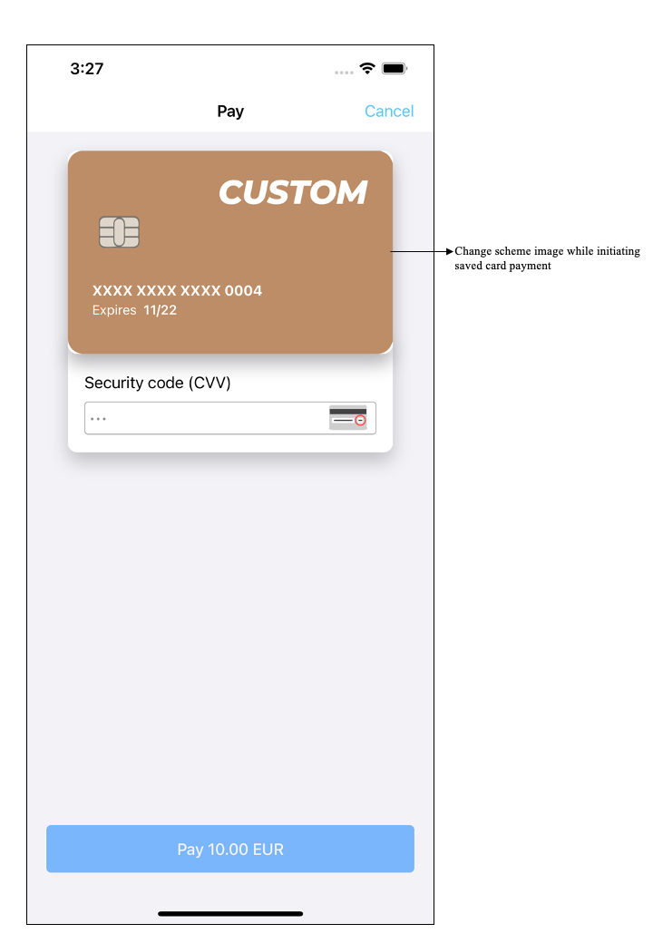
Custom Card Scheme Image
The SDK supports customizing the card scheme image shown to user during saved card payment. In order to display your own custom card scheme image, provide your custom image while initiating a saved card payment as follows:
// Exclude Amex and Visa from supported card scheme list.
let cardStorage = PaymentProcess.cardStorage(
    withMerchant: merchantDetails,
    excludedCardSchemeSet: [.amex, .visa]) { [unowned self] callback in
           // Make the registeration call here and retrun the callback
     }
| Standard Card Scheme Image | Custom Card Scheme Image |
|---|---|
 |
 |
Other Configurations
The SDK offers customization of fonts, margins and other settings thorough NPIInterfaceConfiguration.shareInstance(). Among these settings are CardIO scanning interface customization, a disableSaveCardOption boolean to manage the visibility of save card for later use enquiry as well as custom attributedSaveCardText for the enquiry.
See below for settings that are available via NPIInterfaceConfiguration:
/**
Font to be used for all buttons in the SDK. The point size will be overwritten, just the font name/family will be used.
*/
@property (nonatomic, strong) UIFont  *buttonFont;

/**
Font to be used for all fields/textviews. The point size will be overwritten, just the font name/family will be used.
*/
@property (nonatomic, strong) UIFont  *textFieldFont;

/**
Font to be used in the SDK for all labels. The point size will be overwritten, just the font name/family will be used.
*/
@property (nonatomic, strong) UIFont  *labelFont;

/**
Logo image to be displayed in the card form screen. Width equal to the screen, height = 70.
*/
@property (nonatomic, strong) UIImage  *logoImage;

/**
Wheather or not the save card switch should be on by default.
*/
@property (nonatomic, readwrite) BOOL saveCardOn;

/**
Font to be used for Card IO's "Entry card manually" button font.
*/
@property (nonatomic, strong) UIFont *cardIOButtonTextFont;

/**
Font to be used in the Card IO view for all labels. The point size will be overwritten, just the font name/family will be used.
*/
@property (nonatomic, strong) UIFont *cardIOTextFont;

/**
Choose whether to disable CardIO/Card scanner or not
*/
@property (nonatomic, readwrite) BOOL disableCardIO;

/**
Use either light or dark content for status bar
*/
@property (nonatomic, readwrite) BOOL useStatusBarLightContent;

/**
Content view mode for logo image
*/
@property (nonatomic, readwrite) UIViewContentMode logoImageContentMode;

/**
Choose whether to disable save card for later user option
*/
@property (nonatomic, readwrite) BOOL disableSaveCardOption;

/**
Supported language to use within PiA SDK
*/
@property (nonatomic) PiALanguage language;

/**
Text to be used for save card Label
*/
@property (nonatomic, strong) NSAttributedString *attributedSaveCardText;

/**
Left margin for all buttons used in the SDK.
*/
@property (nonatomic) CGFloat buttonLeftMargin;

/**
Right margin for all buttons used in the SDK.
*/
@property (nonatomic) CGFloat buttonRightMargin;

/**
Bottom margin for all buttons used in the SDK.
*/
@property (nonatomic) CGFloat buttonBottomMargin;

/**
Rounding corners for all text fields of the SDK, value ranges from 0.0 - 0.5 (0.5 suggest full rounded corners).
*/
@property (nonatomic) CGFloat textFieldCornerRadius;

/**
Rounding corners for all buttons of the SDK, value ranges from 0.0 - 0.5 (0.5 suggest full rounded corners).
*/
@property (nonatomic) CGFloat buttonCornerRadius;

/**
 Supported text labels for pay button to use within PiA SDK
 */
@property (nonatomic) PayButtonTextLabelOption payButtonTextLabelOption;
The following demonstrates the use of NPIInterfaceConfiguration to apply custom configurations:
  /* Customize any of the properties of NPIInterfaceConfiguration.sharedInstance
  The uncustomized ones will just use the default value. */

NPIInterfaceConfiguration.sharedInstance().labelFont = UIFont(name: "AmericanTypewriter-CondensedBold", size: 10)
NPIInterfaceConfiguration.sharedInstance().buttonFont = UIFont(name: "AvenirNext-HeavyItalic", size: 10)
NPIInterfaceConfiguration.sharedInstance().saveCardOn = true
NPIInterfaceConfiguration.sharedInstance().logoImage = UIImage(named: "bikbok")

NPIInterfaceConfiguration.sharedInstance()?.useStatusBarLightContent = false
NPIInterfaceConfiguration.sharedInstance()?.logoImageContentMode = .scaleAspectFit
NPIInterfaceConfiguration.sharedInstance()?.disableSaveCardOption = true
NPIInterfaceConfiguration.sharedInstance()?.saveCardOn = true
NPIInterfaceConfiguration.sharedInstance()?.language = Finnish
NPIInterfaceConfiguration.sharedInstance()?.buttonRightMargin = 50
NPIInterfaceConfiguration.sharedInstance()?.buttonLeftMargin = 50
NPIInterfaceConfiguration.sharedInstance()?.buttonBottomMargin = 50
NPIInterfaceConfiguration.sharedInstance()?.textFieldCornerRadius = 0.5
NPIInterfaceConfiguration.sharedInstance()?.buttonCornerRadius = 0.5

/* You will need to give the localized text as and when user changes the language */
NPIInterfaceConfiguration.sharedInstance()?.attributedSaveCardText = NSAttributedString(string: "THIS IS AN ATTRIBUTED TEXT")
For further understanding, please check the sample code as well as these images below:
| Card IO | Card IO dark |
|---|---|
 |
 |
| Card entry | Card entry dark |
|---|---|
 |
 |
| Token card | Token card dark |
|---|---|
 |
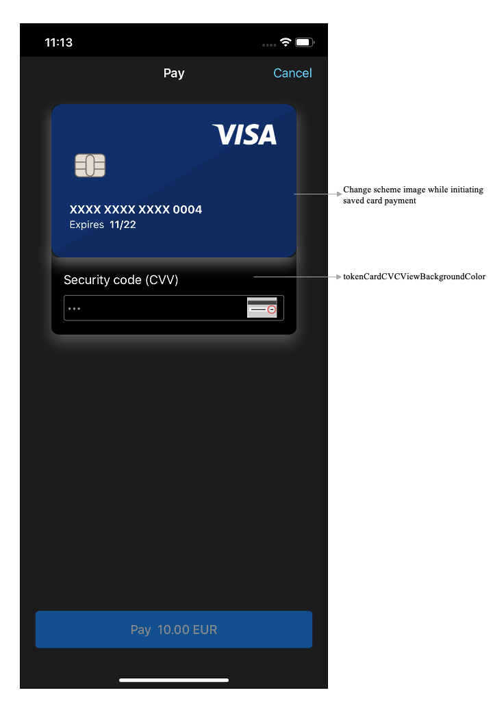 |
| WebView | WebView dark |
|---|---|
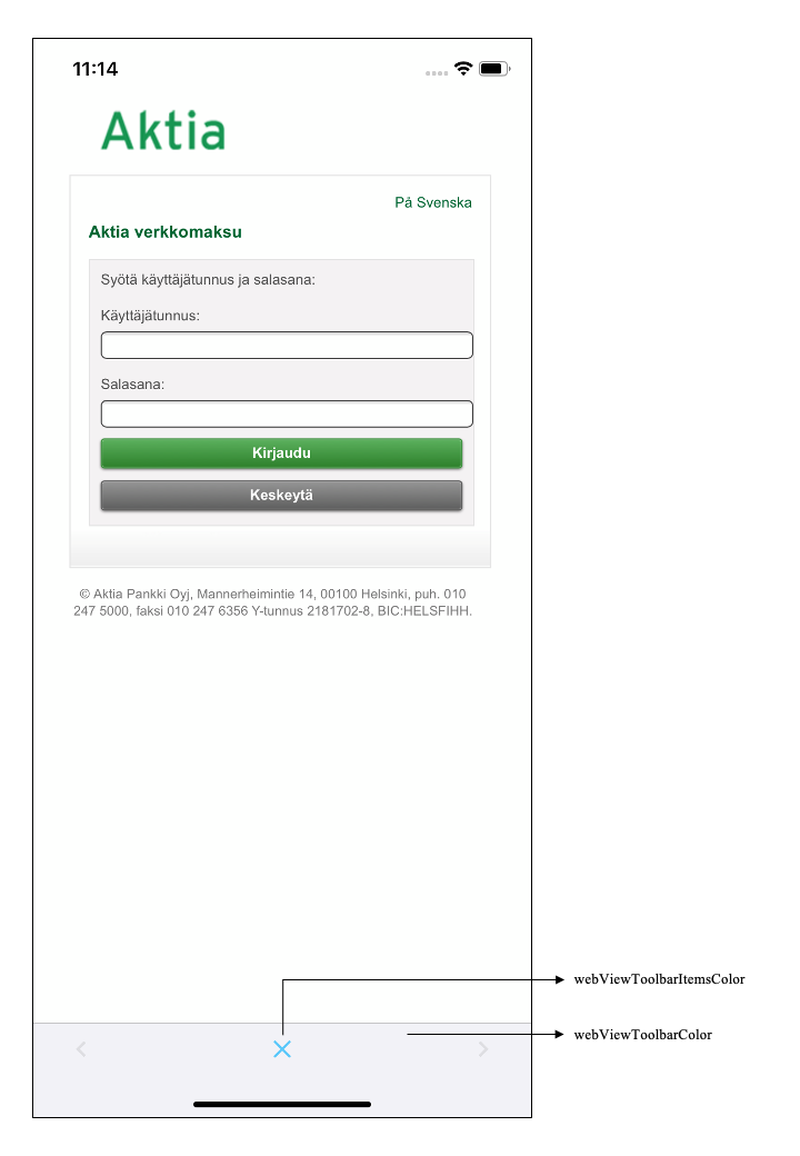 |
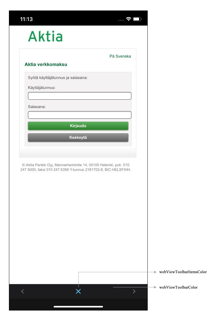 |
As showed in the sample images, there is a dark theme which conforms to Apple MacOS Mojave guidelines. If you wish to try this dark mode, please refer to the below color palette (in HEX color code):
* Navigation bar dark color: #312F30
* Navigation bar title color: #FFFFFF
* Background color semi-dark color: #3B393A
* Subview dark grey color: #595758
* Primary text color: #A3A2A3
* Trivial text color: #575556